


Project Overview
Telstra.com has the largest online audience within the Australian telecommunications industry, attracting an average of 1.8million unique visitors per week. The Telstra.com site has a massive role – to provide self-service capability throughout all stages of a customer’s journey. It’s critical that the site ensures customers can do what they set out to.
The challenge we faced was feedback on poor navigation and customers who told us “I can’t find what I’m looking for” or “make it easier to do…”.
Our response was ambitious; we decided to completely redesign our Information Architecture(IA) which aligned with our shifting company culture from centering around internal process, to putting customer needs first.
We made the bold move to go from content grouped around product (which presented too many options), to a task-oriented approach where the customer is progressively guided to our products/services based on common tasks e.g. “I’ve come to Telstra.com to; ‘Explore’, ‘Shop’; get ‘Support’; or service ‘My Account’”.
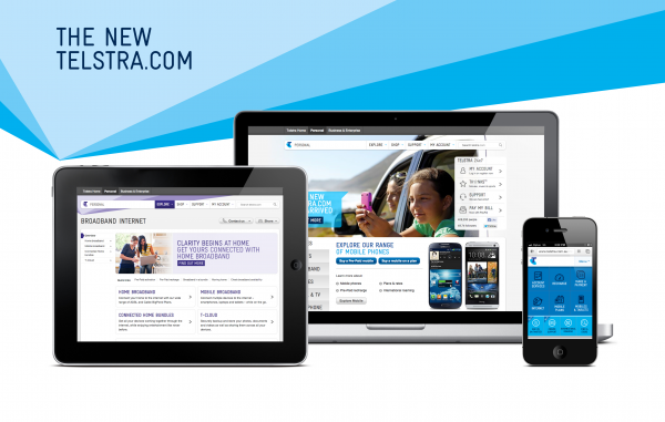
At the same time, we dramatically redesigned the look of the site, giving it a fresh, modern feel that provided consistency and familiarity across our digital properties. In short, as a market leader, we decided to lead the way.
Organisation
Team
Christopher Wood, Michelle Spencer, Shakthi Oke , Bram van der Lans, Andrew Needham, Daniel Martin, Simon Kirby, Sharyn Djuric, Christian Stocker, Matt Todd, Shalini John Natesan, Carmelo Leone, Carmelia Suhardjhono, Steve Hallam, Mason Davies, David Shaw, Naomi Civins, Clinton Cunningham, Heiko Waechter, Andrew Litvak
Project Brief
Telstra Digital inherited a website which had evolved – often haphazardly – over nearly two decades. It was fitting that as we celebrated its 18th birthday, we also steered it towards coming of age as a digital platform.
Telstra.com attracts a range of customers with varying degrees of web savviness. The goal was to redesign the website to make it easy to use regardless of digital literacy.
Critical to the review and update of the IA was making sure the look and feel was cohesive with our signature Online Shop which launched last year and introduced a ‘T-Shirt’ product model - "S,M,L,XL"
The aim was for customers to feel they were browsing one site, moving seamlessly from “Explore” to “Shop”. To do this, we blended Conceptual Design and Strategy, Generative Research, UX and Visual Design. Then we threw in analytics, customer interviews, prototyping and usability testing so we could strip back content to focus on what our customers wanted.
The redesign created an experience that was less frustrating, more engaging, reduced reliance on call centres and in-store channels and simplified the experience of millions of Telstra customers in managing the ways they connect.
Project Need
IA and navigation which helps customers find information faster and easier:
The Telstra.com consumer site went from a product-led journey where customers were presented with too many options, to a simplified task-oriented approach.
Customers are now provided with a targeted framework based on established needs; “Explore”, “Shop”, “Support” and “My Account.” These four ‘front doors’ help to guide customers through, regardless of their knowledge, while providing efficient cross-linking between sections of the website.
Clean and engaging visual design:
Our rule was that visuals and interactions have to be immersive and useful. A prominent use of white space balances imagery and accents of the primary page colour is used to highlight primary actions and content. This makes for a more aesthetically pleasing website, an engaging experience and content that’s easier to find.
Consistent global presentation and principles:
We developed a new style guide featuring specifications, patterns and guidelines for content and digital design execution to enhance coherency and familiarity across the site. Our new digital interactive experience is a foundational piece with a modular design approach to page components that will provide a baseline for future design.
Design Challenge
At the heart of it was the need to re-imagine the Telstra.com information architecture, look and feel, and the experience it gives to what amounts to half the Australian population.
At the same time, we could only make minimal changes to copy and product information to avoid lengthy review and sign-off processes which would inevitability delay our ability to deliver this major change to customers quickly.
We had to be strategic about prioritising the content that mattered most and the content we could address progressively once we got the core issues resolved. To do this, it was essential that we develop a design system and language that was modular, flexible and scalable enough to be effective across our sales, support and service channels, and that worked across a very diverse set of existing content.
We had to create an IA and design language that makes it easy for millions of customers to find the content they need. Design had to be the champion in bringing a variety of product teams and stakeholders together. We worked collaboratively, became leaders, innovators and, ultimately, we did it all under the pressure of formidable time constraints.
Sustainability
We are all about doing more for our customers while minimising our environmental impact.
Telstra has been measuring and reporting carbon emissions since 2000 and is committed to supporting a low carbon future. In addition we continually seek to improve efficiencies and minimise waste in our operations through better design, re-use and recycling. We collect, re-use or recycle all of our e-waste to minimise these impacts and have been a signatory of the Australian Packaging Covenant since 2001.
Telstra.com, together with our suite of mobile and tablet apps seek to make it quick and simple for customers to manage their account online and offer all our customers the option of online billing, including the option of receiving bills by mobile phone.
Digital Experience - Website
This award celebrates innovation and creativity in design of a unique user experience in the combination of text, audio, still images, animation, video, and interactivity content for websites. Consideration given to clarity of communication and the matching information style to audience.
More Details